

I'm not sure how "Manly" this card is, however, I made if for my Dad for Father's Day so that has to count for something, doesn't it?
For my die hard Stampin' Up! fans (like me!) I delved deep into my retired stash of stamps and pulled out one of my all time favorites - Architectural Elements. This set, to the best of my recollection, did not have a very long life in the catalog, it may have only been in a mini, I'm not sure. But, I absolutely LOVE these images and will probably never part with it.
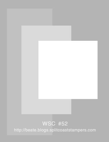
I used the sketch from Beate's weekend sketch challenge last week found at this link: http://beate.blogs.splitcoaststampers.com/files/2008/05/wsc52.jpg
It is a great sketch and probably one I will go back to again and again.
For the stamping, I used two images for my background and stamped them with Black Staz-On ink on Whisper White cardstock. My focal point image was stamped the same way.
The layering was pretty simple once I chose my accent color of Ballet Blue. I placed the Silver Brads across the bottom two layers using my Crafter's Tool Kit Paper Piercer, Positioning Mat and Foam Mat. I started in the middle and worked my way out to each side to get them all even. That Mat Pack is the BEST! Yes, count 'em, there are 13 brads across the bottom!
Anyway, all the layers are adhered together and mounted on dimensionals to add some height. And that's about it. Very simple and clean. My Dad loved it, btw. He used to be a builder and I knew he'd love these images.
Happy Friday everyone! Be sure to check out all the other great projects by clicking on the Blogger's Challenge button in my sidebar. There are some very talented ladies who participate each week!
Wow...stunning card. Love your little splash of blue color..it makes the rest of the card POP! Awesome job.
ReplyDeleteOh, this card is just way too cool!!! I think I remember this set too. Great job. I really like the layout of it!!
ReplyDeleteTHis is just such an awesome card! I love that you added the blue element into the card. It really pops the images. It's just so "manly" so you did a super job on the challenge...
ReplyDeleteOhhh, I think this is a wonderfully elegant "manly" card! Love the brads!
ReplyDeletewhat a great card! I personally wasn't interested in this set, however had I seen this card - it definitely would have made me consider purchasing it!! Definitely a 'manly' card - love the row of brads too!!
ReplyDeleteYour card is Divine, and very elegant yet masculine. I sure do miss the old Stampin Up images.
ReplyDeleteThat set was before my time..I know I would of purchased it.
Connie Paxman
This is stunning...i love that little pop of color! Great job! {SMILES}
ReplyDeleteGreat B&W with just a hint of color - makes a wonderful "manly" card.
ReplyDeleteNice! Great stamps.
ReplyDeleteOkay I must admit that I "hated" that set but love what you did with it on this card. It was just so not my style but this card is wonderful. It has nice clean, crisp lines and the color pop of the ballet blue sets everything off.
ReplyDeleteI think any man would love this! I love how you used the stamps and great job on Beate's sketch! This works beautifully with it!!! TFS!
ReplyDeleteLove this card Robin! I really need a set like this! The little bit of blue is such a great element to this wonderful design! :D
ReplyDeleteI love how the layout "builds" up the main image! Great colors, too!
ReplyDeleteThis is perfect for a manly man card. Very Frank Lloyd Wright!
ReplyDeleteThe black and white with just a touch of blue is so striking!
ReplyDeleteVery unique and gorgeous Robin. I love the architectural elements!
ReplyDeleteOooooo! I always loved that set, but found it difficult to work with.....it is long gone from my collection. Now after seeing your beautiful card, I kind of wish I had kept it! This is a spectacular card....a B&W stunner AND an awsome "man" card.
ReplyDeleteAh...I so wish I'd have purchased that set when I had the chance. I had it on and off my order many times. Great job with the challenge! Love it!
ReplyDeleteWOW! This is just beautiful! Great card!
ReplyDeleteAhh! You used one of my all-time favorite sets! It was in the yellow catalog (if my memory serves me right) and yes, it was only around one year... much like many of my fav's! Beautiful card too! I wish I had held onto mine now.
ReplyDelete